Create-A-Greeting-Card Scholarship Look Back Series – 2007 Winning Design

Welcome back to another installment of our Create-A-Greeting-Card Scholarship Contest Look Back Series. 2007 was the first year that we started running an annual scholarship contest and we weren’t exactly sure what to expect. Since we are constantly on the lookout for ways to give back, we thought this was an excellent way to help a student that tied in perfectly with our products. It was our goal to inspire the youth to recognize quality and beauty and to capture it, whether that be in the form of a simple digital photo or a finished piece of art from their art class or computer lab.

We were all nervous because we were not sure how it was going to turn out but in the end we were blown away by the response. We received over 15,000 entries in that first year! It caused us all to take a step back and really see that this was something that clearly needed to continue. In the end, Elizabeth Digre was selected as the winner for her beautiful entry depicting a stunning winter scene of a lake surrounded by snow covered trees and the sun shining through the branches.

After the entry was selected as the winner, our artists turned it into the stunning Season’s Greetings Golden Snowscape Card.

[m-vslider id=”14″]

The card was stamped with gold refractive foil and enhanced with some embossing (raising some details of the image to give it a three dimensional effect). The gold foil was used to accentuate the snow covering the trees to really make the design pop. A frame was also added around the image to draw the attention to the beautiful winter scene. Once we saw the final product we knew that this contest was something that needed to continue.
Create-A-Greeting-Card Scholarship Look Back Series – 2008 Winter Scenes

Welcome back to the Create-A-Greeting-Card Scholarship Look Back Series. The 2008 winner, George Humeston, submitted a beautiful design featuring a calm winter scene. In today’s entry, we wanted to showcase a couple of designs in our line that also depict stunningly beautiful winter scenes.

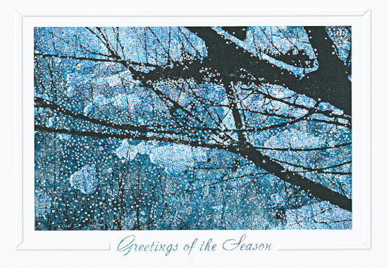
2008 Winning Entry – Full Moon Winter Night Christmas Card

Full Moon Winter Night Christmas Card

 Card Description: The majesty of winter reveals itself in a breathtaking silhouette of moonlit tree limbs and iridescent falling snow upon a dreamlike, snow-blanketed landscape. Subtle blends of blue and aquamarine illuminate this strikingly beautiful and powerful painting. Expect awestruck recipients!

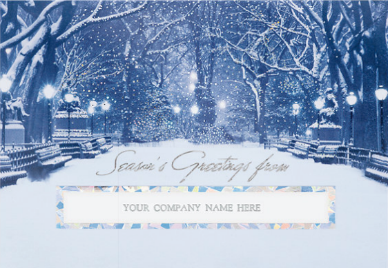
City Snowfall Die-cut Seasons Greeting Card

City Snowfall Die-cut Seasons Greeting Card

Card Description: This cobalt blue card shows a lovely night in a town park setting. Streetlights glow within the backdrop of winter snowfall on this dazzling holiday card. The die-cut window in this card will showcase your company name in the foreground to all of your business associates, corporate clients and friends.

Snow Frost Pines Season’s Greeting Card

Snow Frost Pines Season's Greeting Card

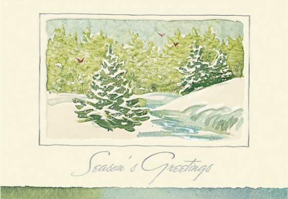
Card Description: The tranquil setting and soft watercolors of Snow Frost Pines is a gentle murmur of Season’s Greetings. Send this bit of serenity to your valued corporate clients, business contacts and friends.

Winter Impressions Holiday Card

Winter Impressions Holiday Card

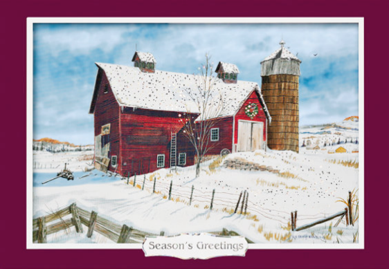
Card Description: Christmas in the Country! What better way to spend the holiday. This old barn is even painted a bright red to celebrate. This is a charming watercolor scene with such great detail you can almost feel the fresh sunshine on your face. Finished off with gold foil accents, this is a lovely card to send or receive.

It is always nice to look at the various different winter scene designs that we have in our line and George’s beautiful entry is a great addition to that group of cards. It truly is a stunning representation of the beautiful calm of winter.

Create-A-Greeting-Card Scholarship Look Back Series – 2008 Finalist Highlight

Welcome back to another installment of the Create-A-Greeting-Card Scholarship Contest Look Back series. As we have done for the other contest entries, we always like to draw attention to the finalists.

Every year we get thousands upon thousands of amazing submissions and even through there is only one winner, the finalists deserve to receive as much attention as possible as well. In today’s entry, we wanted to show off a couple of submissions form our finalists which we particularly liked. You can view all of the finalists in the 2008 Scholarship Finalists Gallery. Also, don’t forget to let us know which of the below designs is your favorite in the poll right underneath the gallery.

[polldaddy poll=”7393833″]

Create-A-Greeting-Card Scholarship Look Back Series – 2008 Finalists

Welcome back to another entry in our Create-A-Greeting-Card Scholarship Contest Look Back Series. As we continue our look into the 2008 contest we wanted to use today’s post to showcase two beautiful finalists entries which were turned into a set of amazing Christmas cards in our line. As has been the case in most years of the scholarship contest, we found a couple of entries which while they weren’t selected as the winner, we felt were just too beautiful to pass up.

The first entry is from Corinne Thompson, who submitted a beautiful painting of a quiet and serene view of a snow-covered hill glistening with freshly fallen snow on a cold winter’s day. The scene was just too beautiful to not be added to our line. When we converted the entry into a card, there was not much that needed to be done. Some of the designs details were enhanced with some embossing to give them a three dimensional feel and really make them pop! We also added some multi colored reflective glitter to give the sensation of falling snow before adding it to our line as the Glistening Snowscape Holiday Card.

[m-vslider id=”13″]


The second entry was from Devon Rutherford, who submitted an amazingly detailed painting of a poinsettia with rich red petals and bright yellow stamens. The entry was placed within a beautiful white frame with golden accents to give the card an elegant look and as added to our line as the Seasonal Splendor Holiday Card

[m-vslider id=”12″]

It truly is a testament to the skill and creativity of the entrants when you see just how great the designs are and how just a few enhancements to the submissions can turn them into stunning cards. We hope you enjoyed this look into the 2008 finalists and look forward to next week when we continue our look behind the scenes of the 2008 Scholarship contest.

Create-A-Greeting-Card Scholarship Look Back Series – 2008 Winning Design

Welcome back to another installment of our Create-A-Greeting-Card Scholarship Contest Look Back Series. The 2008 scholarship was our second run and we were all excited and ready to get going. Clearly there was alot of excitement from our first scholarship contest and boy was it evident in the final number of submissions which totaled over 11,000! There were so many beautiful entries to choose from and in the end, George Humeston was selected as the winner for his beautiful painting depicting a stunning winter night scene with snow covered tree branches.

After the entry was selected as the winner, our artists turned it into the stunning Full Moon Winter Night Christmas Card.

[m-vslider id=”11″]

There wasn’t much that had to be done to the entry itself for it to be turned into the card but we did add some enhancements. The card was stamped with silver refractive foil and enhanced with some embossing (raising some details of the image to give it a three dimensional effect). Falling snow was added in with the use of silver foil dots to really drive home the winter scene feeling. A white frame was also added around the image to give it the framed painting feel. It was a beautiful entry which easily became a beautiful card in our line.

Create-A-Greeting-Card Scholarship Look Back Series – 2009 Finalist Showcase

Welcome back to the 2009 version of the Create-A-Greeting-Card Scholarship Contest Look-Back series. In today’s entry, we wanted to show off a couple of the finalists designs that, even though they were not turned into cards, we still thought should be seen by everyone. You can browse through the full collection of finalists from the 2009 contest in the 2009 Scholarship Finalists slideshow, but below are some of our favorites from the group. We would also love to hear your opinions on which design you liked so don’t forget to vote in our poll underneath the images!


[polldaddy poll=”7342299″]

Create-A-Greeting-Card Scholarship Look Back Series – 2009 Finalist Designs

In today’s entry for our Create-A-Greeting-Card Scholarship Look Back series, we wanted to put the spotlight on a couple of finalist entries which were selected to be made into cards. Every year we receive thousands upon thousands of entries for our scholarship and while there can only be one Scholarship Winner, the amount of amazing artwork that we receive is so great that we always like to pick out a few finalists and add them to our line of cards as well. In the case of the 2009 Scholarship, two finalists designs were chosen to be made into cards.

The first design was submitted by Daniel Romlein of Potsdam, NY. Daniel painted a beautiful winter scene featuring Birch trees in a snow covered forest. When we first saw this entry, everyone in the room loved it. It brought to mind the holiday season at it’s most relaxing moment. This design was transformed into the “Shimmering Birches Holiday Card” after some additions like foil glitter depicting snow and a beautiful frame to center this amazing image and provide a background for the “Season’s Greetings” front sentiment.

[m-vslider id=”9″]

The second design was submitted by Katie Maupin of Jacksonville, North Carolina. Katie submitted an amazing painting of a snow covered home with a snowman in the front and the words “Seasons Greetings” written on the bottom. This design had such a warm and inviting feel to it that we knew that we had to add it to our line Season’s Greetings Cards. It was officially transformed into the “Warm Winter Welcome Christmas Card“. You can see some of the changes that were made to enhance this beautiful image such as a frame covered in snowflakes and glitter to represent the falling snow.

[m-vslider id=”10″]

Even though the above entries did not win, they deserved to be added to our line of cards. It truly is a testament to the quality of entries that we receive each year and we are always looking out for new designs to add to our ever expanding line. We hope you enjoyed this look into two great entries from the 2009 scholarship contest and we look forward to seeing you here next week for our next entry into the Create-A-Greeting-Card Look Back series!

Create-A-Greeting-Card Scholarship Look Back Series – 2009 Winning Entry Transformation

In our current entry into the Look Back Series for the 3rd Annual Create-A-Greeting-Card Scholarship Contest, we are going to take a look into the transformation of Lauren Ondreko’s winning entry into the final card that we have on sale today.

The process begins with Lauren’s entry being scanned into the computer to create a Hi-Res version of it for editing. Below is the original artwork that Lauren Submitted to the scholarship contest.

Lauren's Original Entry

This is what Lauren’s entry looked like after it was scanned into the system for editing.

Scanned in Version

The next step after scanning in the artwork is to clean up the image and sharpen the edges so that the production person, or Imager, can get to work. At this point the front sentiment is also added to the card and the card design begins to take shape!

Revised Art

Once the image is cleaned up and the front sentiment is added, the card is ready to go through the separation process. The imager determines the different colors and finishing techniques to be used on this Christmas card design. There are all kinds of options to choose from such as including ink color choices, die cutting, foil-stamping and foil embossing.

The creative team will get together and go over all of these choices to test out and find the best one to use. There are many different colors of paper stock, and some of these colored stocks will be tested with different types of inks or foils, depending on the design. Once the team narrows down the combinations, the card is sent to production so that the creative team can actually see all of the different choices and decide which will be the final one. Take a look below to see what these test designs look like.

[m-vslider id=”8″]

After much discussion and back and forth, the final design was chosen and added to our line as the Snowman Surprise Christmas Card.

Snowman Surprise Christmas Card

Once again, we want to thank you for stopping by and taking a behind the scenes look into the transformation of Lauren Ondreko’s entry into the beautiful card it is today. We hope you come back next week for another entry it our Look-Back Series!

Create-A-Greeting-Card Scholarship Look Back Series – 2010 Winning Entry Transformation

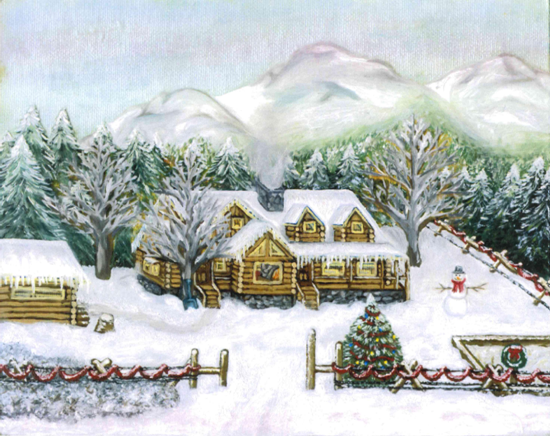
In today’s entry for our Scholarship Look Back Series, we wanted to give you a better look into some of the additions that were made to the 2010 Scholarship Winning entry that was submitted by Dawnee Burson. In the below image, you’ll see some of the enhancements that were made to the beautiful winter scene that Dawnee painted in order to really transform it into an amazing card.

[m-vslider id=”5″]

If you look at the below slideshow, which is zoomed in on the cottage on the left side of the painting, you really begin to notice some of the details that were added in. You can see that the trees in the background as well as the garland on the fence have been covered in gold foil in the form of glitter to really help give them a snow covered feel. You can even see that the window in the cottage has been filled with little ice skates. We look at every detail when we transform entries into cards!

[m-vslider id=”3″]

Below you can get a better view of the little enhancements that were made to the trees with the addition of the gold foil to really make the snow pop on the final card design!

[m-vslider id=”4″]

In the end, the entry only needed a few little touch ups to become the final image you see in the Log Cabin Greetings Holiday Card you see in our line today. That is a true testament to the amazing skill and creativity of Dawnee Burson. Come back next week as we continue to give you a behind the scenes look at our $10,000 Create-A-Greeting-Card Scholarship Contest.

Create-A-Greeting-Card Scholarship Look Back Series – 2010 Winning Entry

In our first installment of the 2010 Scholarship Contest Look Back Series, we wanted to give you a behind the scenes look into the very interesting and creative idea behind 2010 Scholarship Winner Dawnee Burson’s winning entry.

As Dawnee explained it in her letter that she submitted along with the entry, “I wanted to do a Christmas calendar card with four layers, one for each season that could be pulled off the front of the card as the seasons change”.

In order to accomplish this, Dawnee started with a base farm scene illustrating the fall season. She then provided us with acetate overlays (sheet of clear plastic laid over a background) which depicted different seasons for the same farm scene. Each overlay would have its own painted details which we would then use to lay on top of the base painting in order to change the seasons. In the slideshow below, you can look through Dawnee’s interpretation of the four seasons. Look at the differences in the details between each version from tire swings in the summer version to a scarecrow in the fall version. We think Dawnee came up with an amazingly creative way to show off different seasons all while using the same painting as the base!

[m-vslider id=”2″]

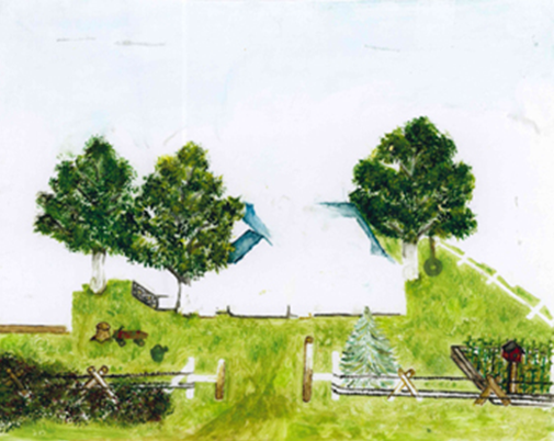
Below is the summer overlay which Dawnee provided. As you can see, the empty areas allow for the details from the original painting such as the mountains and forest to show through while also being overlaid with the new additions such as the tire swing and roof.

Acetate Overlay Depicting summer season.
Acetate Overlay depicting Summer season.

We hope you enjoyed this behind the scenes look into just how creative Dawnee’s winning entry really was. We hope you come back next week as we continue to reveal even more about the 2010 Scholarship Contest!