Design #232AR – Gift Bag Wishes

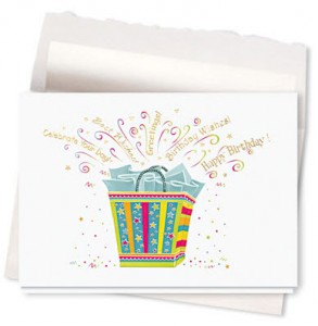
Design #232AR – Gift Bag Wishes Birthday Card, is one of the Gallery Collection’s classic corporate birthday cards that would most certainly impress your clients or employees when they open the envelope to reveal this beautiful card that greets you with an assortment of birthday wishes.

This birthday card is furnished on a glossy white background with a gift bag in different shades of sea foam, yellow, gold, lime & fuchsia. The gift bag is covered in embossed stars and stripes, making for a very festive presentation. The bag has sea foam tissue paper folded perfectly and peeking out from the top. Above the tissue paper are an array of tiny stars and all sorts of happy birthday wishes bursting from the gift bag in gold foil.

Design #232AR - Gift Bag Wishes Birthday Card
Design #232AR - Gift Bag Wishes
Birthday Card

What a feeling of thoughtfulness your business clients, partners or employees would feel when they open up the envelope to reveal this elegant and also fun corporate birthday card.

Announcing the 4th Annual Create-A-Greeting-Card Scholarship Finalists

After months of receiving and reviewing entries for our 4th Annual $10,000 Create-A-Greeting-Card Scholarship, we are so excited to at last be able to reveal the Scholarship Finalists !  Be sure to check out the entries and tell us which one you “Like”.

This year, we have a total of 177 possible contenders for the big $10,000 prize! And don’t forget, we also are giving away an additional $1,000 to the school of the winner.  This is truly a wonderful opportunity for one talented student to help finance their education as well as showcase their artistic abilities.

Certainly, those students who put in time and effort to create and submit an entry whether it be of a Christmas Card, Birthday Card or some other occasion, all share and demonstrate important qualities needed for success in life. They all show initiative and taking responsibility for one’s self and future.

So on March 16, 2011 when we announce the lucky winner, know that each and every one of you who made a sincere effort at creating a beautiful greeting card design should also be congratulated!

Best of luck to all of our finalists!

Design #850CS – Midnight Snowflake Sparkle

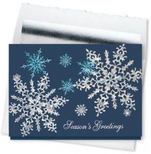
Design #850CS – Midnight Snowflake Sparkle Holiday Card, really catches your attention. I think it’s a perfect design to send to business associates. I don’t often know which holidays are celebrated by each of them, but I do know that not all of them celebrate Christmas in the religious sense. These holiday greeting cards even work for sending good wishes to my myriad of friends. After all, who could take offense at Mother Nature’s beautiful snowflakes? Both the lovely falling snowflakes and the gorgeous color scheme of shimmering foils and deep blue card stock make this a design that anyone can treasure, no matter what they celebrate.

Design #850CS - Midnight Snowflake Sparkle Holiday Card
Design #850CS - Midnight Snowflake Sparkle
Holiday Card

Like a 3-D movie, the brilliant starry snowflakes of this design seem to be floating in and out of a midnight blue background. The glow of solid silver and solid teal foils are magically balanced with reflective silver foils, in exquisitely embossed lacy detail. What a rich way to send my Season’s Greetings!

Put the Person Back Into Personalized Christmas Cards!

Did you ever get a personalized Christmas card and notice there was nothing too personal about it? It almost seems the once thoughtful tradition of sending a Christmas card has become a thing of the past. If you’re like me, you get the same, predictable cards – some of which aren’t even signed at the bottom! So, when I send my cards out, I make sure to spice each one up with a little something extra to make the recipient feel as though the card was made just for them. And since I only send cards to a few relatives and close friends, it’s easy to figure out what would make them smile a little brighter after opening my card.

First, you should try to choose a design with a common theme that most of your recipients would appreciate. For example, since all of my family and friends are from a big city, I usually try to select a card that has a skyline or city lights. I chose Design #844CX – Sparkling Skyline, two years ago which was a big hit!

Next, personalize the inside to reflect the way you feel during the Christmas season. After all, that card may be the only communication you have with a distant friend or relative for months at a time. I try to include a greeting that reflects my feeling about Christmas and conveys a hopeful message for the New Year. After selecting the greeting, don’t forget to let your recipients know who the lovely cards came from! I always let The Gallery Collection print my name at the bottom – it gives them such a classy finish.

If time allows, add a quick handwritten message. This is a thoughtful way to let people know the card was made just for them. For example, my mom absolutely loves anything having to do with our beloved cat Fleecie who I ended up “adopting” when I got my first apartment after college. So, I’m always sure to jot down a few details on Fleecie’s latest habits of chewing my brand new pair of shoes or finding his way to tip over the catnip jar.

Taking these few extra steps will ensure that your card stands out among all the rest, not to mention your genuine intent of the season will really show through to your recipients. After all, isn’t that what sending Christmas cards is all about?

Design #124CS – Doc’s Race with the Stork

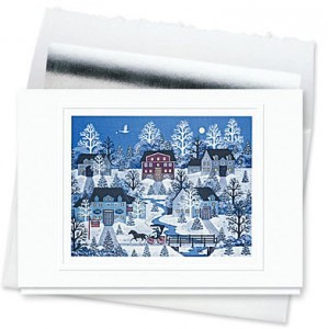
If you like the country-inspired look and feel for your personalized Christmas cards, then you will love design #124CS – Doc’s Race with the Stork Holiday Card. This card is a perfect example of country life in New England. There is such a beautiful story in this painting by Jane Wooster Scott. Just sit and look at all the detail and find the parts of the plot – a late evening sky with a stork carrying a newborn baby; a sign of renewal and rejoicing. Then in the lower portion of the card is the doctor in the carriage racing to get to the expected parents before the stork arrives. The soft blue cast upon the village and the snow on the ground creates a wonderful cold, crisp feeling of winter with a moonlit sky above. You can almost feel the wind blowing through the village. Gee, I wonder if this could also be Christmas Eve to boot!

Design #124CS – Doc’s Race with the Stork Holiday Card
Design #124CS – Doc’s Race with the Stork
Holiday Card

This holiday card gives me such a warm, wonderful feeling just looking at it. Imagine how your friends and family will feel when they receive it in the mail for Christmas. I happen to love any card or picture that tells a story. It makes it so much more interesting and fun to give and receive. This card is a favorite of many people and is also suitable for framing. It is sure to be enjoyed for many Christmases and holiday seasons to come!

Personal Sympathy Cards Were Gratefully Received

Throughout the course of my life, I’ve sent many personal sympathy cards to friends, relatives, and co-workers. I’ve also been on the receiving end, having lost several family members over the last several years. But I was quite surprised to receive sympathy cards for a recently deceased family member. You might be wondering why I was surprised, considering the fact that sending sympathy cards is a pretty common practice here in the United States. But this “family member” was actually a pet. Spike was with us for 17 years! That’s longer than most marriages these days, so it was with great sadness we were faced with ending his suffering.

Pets don’t live as long as humans but the sadness felt can be the same. I know people will say he was just a cat, but he was more. He was a sounding board when I needed to vent, a comfort when I felt sad, and a clown who could make me laugh. While the whole family felt sadness with the decision that had to be made, no one was sadder than my 19-year-old daughter. Spike had been a part of her life for as long as she could remember. So the sympathy card that arrived a few days later from our vet was gratefully received.

3rd Annual Create-A-Greeting-Card Scholarship Design Process – Part 3

We have arrived at the third and final part of our “Making a Winning Doodle into a Dazzling Christmas Card Design” series. So far in Parts 1 and 2, we’ve gone through the process of scanning the image, cleaning the image up, changing the artwork to fill space, and separating the image to determine colors and finishing techniques. We’re almost done, and soon we’ll have a beautiful holiday card.

The creative team has gotten together to give critiques and advice on how they feel the design should look. At this point in the process the Creative Coordinator decides which colors and styles will be tested. There are many different colors of paper stock, and some of these different colored stocks will be tested with various inks or foils, depending on the design. The card is sent to production so the creative team has a chance to actually see all the different choices, and decide which will be the best-seller.

Here is a look at the design in the early process of separation to see which colors or foils would look best.

Create-A-Greeting-Card Contest Scholarship Winning Design

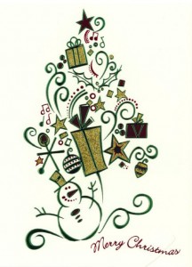
When the cards come back from production there are many different styles to choose from. This is an important step in the design process, as the Gallery Collection is always looking for the most visually appealing and creative Christmas cards. Here are some examples of the different foils and colors that were tested to determine the final appearance of our winning card.

Some of the different color combinations to choose from included buff cards with green foil, and white cards with multi-colored foil.

Design Concept - Buff Card with Green Foil Design Concept - White Card with Multi-Colored Foil

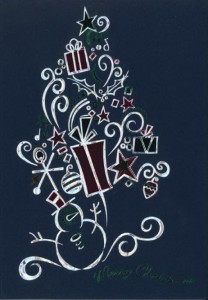
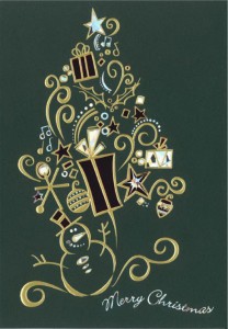
The Gallery Collection also offers a wide array of beautiful dark stock cards. Since there were so many options we just had to test them all!

Design Concept - Dark Blue Card with Silver Foil Design Concept - Dark Red Cards with Gold Foil
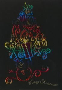
Design Concept - Dark Green Card with Gold Foil Concept Design - Black Card with Multi-Colored Foil

The creative team will once again gather to review and discuss the different holiday cards. They will decide what works and what doesn’t work in terms of color, style and finishing. They will also decide if any revisions need to be made to the final design. With so many choices and options, this isn’t always an easy process. But in the end it’s worth it, as the Gallery Collection has some of the most visually stunning cards available.

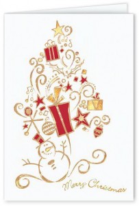
After much discussion, a final design is chosen. It combines the beauty of Lauren’s winning artwork with the amazing skills of our creative team. Two amazing cards were made from this one beautiful design, and they will truly take your breath away!

Design #798CW - Holiday Tree Christmas Card

Design #730CW - Snowman Surprise Christmas Card
Design #730CW
Snowman Surprise
Christmas Card

Every design that graces the cover of our catalogs and is displayed on our website must adhere the high quality standards of the Gallery Collection. Changes are made to most designs, whether it’s sizing, color, or addition of foil. So whether the design has been submitted by one of our talented artists, or the design is a scholarship winning contest entry, they all go through the same process. This ensures that we always have the most beautiful, high quality greeting cards around.

3rd Annual Create-A-Greeting-Card Scholarship Design Process – Part 2

In Part 1 of our “Making a Winning Doodle into a Dazzling Christmas Card Design” series we discussed the scanning process of the original artwork from the scholarship contest. Now we delve further into the process of creating a card.

The original artwork is given a Hi-Res scanning into our system, where a graphics program makes the image nice and crisp. This cleaning process makes the art suitable for reproduction. Once the image is set the production person, or Imager, gets to work.

The Imager has many different things to do at this point. Lauren’s artwork needed to be changed to fill space. The original piece was vertical, and the personalized Christmas cards that will feature this design will be both vertical and horizontal. The artwork is proportioned for a horizontal holiday card so that all the aspects of the original design are not lost.

This is Lauren’s artwork after it has been scanned, cleaned and revised.

Create-A-Greeting-Card Scholarship Contest Winning Artwork

The image then goes through a separation process. The Imager prepares the file, determining the different colors and finishing techniques to be used on this particular Christmas card design. There are many different options for each piece of art, including ink color choices, die-cutting, foil stamping and foil embossing.

The creative team will gather together and discuss these choices. Everyone will share their insights and give critiques and advice on how they feel the design should look. This creative input helps to make the final design a unique vision for the Gallery Collection and the Christmas card itself a thing of beauty.

The artwork that Lauren submitted to the scholarship contest is coming to fruition through the hard work and creative minds of the Imagers and everyone on the creative team. This design will become personalized holiday cards that Lauren, and everyone at the Gallery Collection, will be very proud of.

Coming up in Part 3, our final installment, we’ll share how the final decisions on colors, foils and the appearance of the card as a whole are made. You won’t want to miss this!

Christmas Card Winning Scholarship Design Turns from Doodle to Dazzling! An Inside Look at the Process – Part 1

How exactly do we take the simple line drawing submitted by Lauren Ondreko, winner of our 3rd annual Create-A-Greeting-Card $10,000 Scholarship contest, and turn it into a potential best seller in our Christmas cards line? You are about to get a rare glimpse inside the process of how a leading publisher of business Christmas cards (yes, that would be us) works some holiday magic!

The contest was a very exciting one this year; with so many talented student artists and photographers submitting their work, the decision was a difficult one. After much deliberation, we finally chose the design submitted by Lauren Ondreko from Friendswood High School in Friendswood, Texas.

Lauren’s artwork, a beautiful line drawing filled with symbols of the holiday season, turned out to prove a somewhat controversial choice as our winner of the $10,000 prize. It was a truly fine piece of art that just so happened to be submitted on a sheet of loose leaf paper! The submission style of the art work caused a bit of a stir, but in the end it was the design that won, and not the medium on which it was received.

Here at the Gallery Collection there is a wonderful creative team who, year after year, successfully turns out some of the most beautiful and original Christmas cards in the greeting cards market today. So just what did they do to this winning doodle to make it into one of our holiday cards that people everywhere will want to purchase?

It all started with the design itself. The original design received a Hi-Res scanning into our system. Once the image had been scanned, it was cleaned up with a graphics program. This takes all of the fine line work and makes it smooth and neat for reproduction.

Here is the original artwork submitted by Lauren for the scholarship contest.
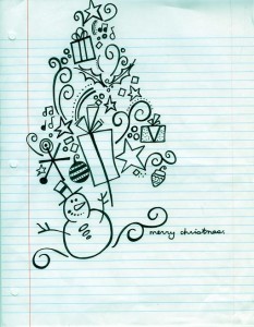
CAGC Scholarship Contest Original Artwork

This is what Lauren’s drawing looked like after it had been scanned into the system, but before the image had been cleaned up.

CAGC Scholarship Contest Scanned Artwork

The artwork cleaning process is an important one. Sharpening the image makes the art suitable for reproduction, which in turn makes a beautiful holiday card. Without this process the image could appear rough or blurry, and would be unfit for use. Once the image had been properly taken care of the production person, or Imager, got to work their own magic on the design!

The next step of the process will follow the design as it moved through the Imager’s hands. Lauren’s art was ready to begin the creative journey of colors, spacing, and everything else that would make it the dazzling Christmas card it was destined to become. Stay tuned for Part 2 and Part 3, where we will give you the inside scoop on just how that happened!
Design #688CX – Merry Christmas Sleigh Bells

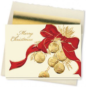
Sending and receiving Merry Christmas cards is a special tradition that can bring back childhood memories that trigger the sounds of the season. Sleigh bells are one of those happy sounds that are synonymous with the holiday season. Many carols have bells in the lyrics or use bells as one of the instruments in the background. The bells on design #688CX, Merry Christmas Sleigh Bells Card, are good enough to hang on a one horse open sleigh! Six gold bells hang from a luxurious red ribbon. The embossed detail on buff card stock gives this design a rich quality that will catch your eye and delight the recipient. Gold foil or red ink will make the greeting and personalization on the inside match the color scheme on the front.

Design #688CX - Merry Christmas Sleigh Bells Card

Just looking at the beautiful bells on this card can bring back warm memories of Christmases past. It’s a good feeling you’ll want to share with everyone!