Congratulations to our Eighth Round Winners!
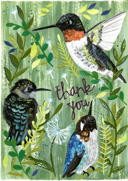
Entry #4504
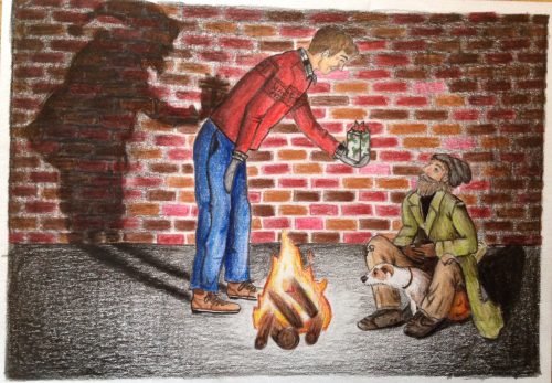
Entry #4450
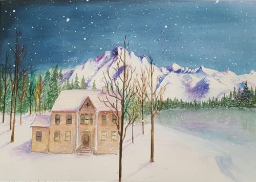
Entry #4384
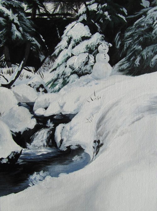
Entry #4341
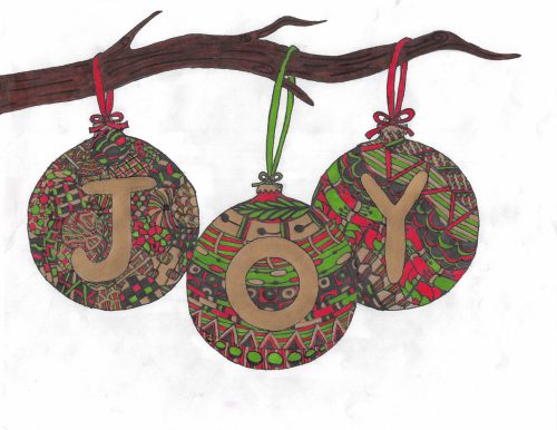
Entry #4186
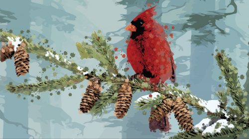
Entry #4128
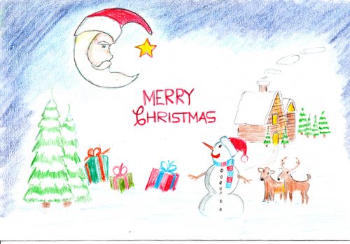
Entry #4079
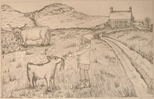
Entry #4076
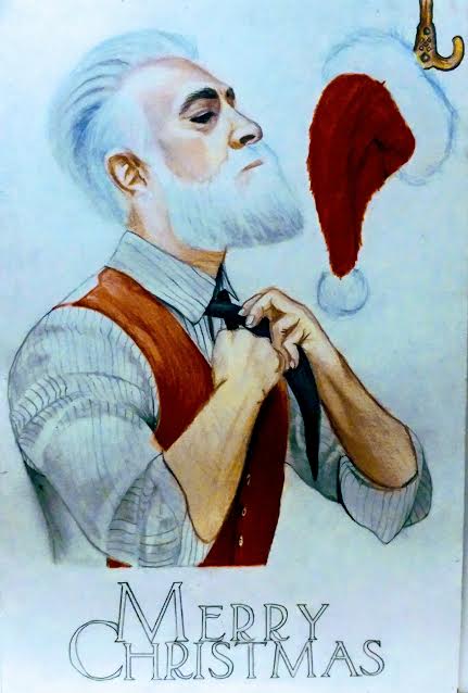
Entry #3692
Entry #3283
Previous
Next
- Go to slide 1
- Go to slide 2
- Go to slide 3
- Go to slide 4
- Go to slide 5
- Go to slide 6
- Go to slide 7
- Go to slide 8
- Go to slide 9
- Go to slide 10
I submitted a card into this round and fell short at the last minute into 11th place. I would like to tell the gallery collection scholarship committee that the Facebook “Like” button should not be on the card entries during the voting round. Many people were clearly confused by this button and would click this instead of the vote button. I had approximately 310 likes the most of any card in the round, but not the votes to account for them.
3692 is a cool modern take on Santa Clause and 4450 is also great. I like the way 4450 shows the nice man as Santa in the shadow.
The snow scene with the creek and snowman is beautiful. That could translate into a stunning card.
Ha! Is that a hipster Santa I see? That is for sure a new subject matter lol
3692 is the best design ever! So great!
Design #4450 and the shadowy effect to the left is just brilliant!
Great winners this round! I love seeing the wonderful young talent!
I would totally buy that hummingbird thank you card. I hope that one wins!
The snow scenes are really pretty. I hate that I am looking at that out my window right now, but it is lovely as artwork.
The cardinal is interesting. It looks almost as if it was done with a bunch of different techniques. Something I haven’t seen before.
most of those could be such great cards! it would be cool to see a few of them win something.
That one looks like Santa after a diet haha! Too funny!
The thank you card stands out to me. It is something very different than any other entrants.
A friend of mine entered last year and he got very far. That was the first time I heard about the scholarship. I think this is so great!
Really great talent! In a time where the arts are especially not being funded, it is great to see a company stepping up and helping out like this. A scholarship like this would have helped me out tremendously when I was a student.
I’ve liked the animal ones in each round. Wish they all could become a card.
I missed this round – the artwork is great. Glad I caught a glimpse!
Too bad I didn’t know this contest existed sooner. I will be marking it down for next year to have my students submit.
I wish I could draw. The talent is so impressive.
Hipster Santa! yessss! Love it!
The hummingbird looks like it is all ready to be a card. Shows a lot of effort and talent.
i really like to look through the different entries. it is cool to see the different ideas people come up with. all so unique.
The judges must have a hard time deciding a winner. I give a lot of credit to the students who enter.
That Santa Claus moon card is delightful. I think it would make a good card to send if your company deals in products for children or is some kind of charity.
In a time when arts funding is not valued it is incredible to see a company supporting it. I will always buy my cards here.
I like the joy ornaments on the tree branch. The coloring is kind of antique.
Cardinals always mean winter and Christmas to me. I hope you consider this cardinal design for the winner.
That sweet card with the Santa-face moon is great. I know it’s not your usual corporate card but it would be ideal for children’s charities to send out.
The art is incredible in all the rounds. I think the talent is so impressive especilaly for being students,