We have arrived at the third and final part of our “Making a Winning Doodle into a Dazzling Christmas Card Design” series. So far in Parts 1 and 2, we’ve gone through the process of scanning the image, cleaning the image up, changing the artwork to fill space, and separating the image to determine colors and finishing techniques. We’re almost done, and soon we’ll have a beautiful holiday card.
The creative team has gotten together to give critiques and advice on how they feel the design should look. At this point in the process the Creative Coordinator decides which colors and styles will be tested. There are many different colors of paper stock, and some of these different colored stocks will be tested with various inks or foils, depending on the design. The card is sent to production so the creative team has a chance to actually see all the different choices, and decide which will be the best-seller.
Here is a look at the design in the early process of separation to see which colors or foils would look best.

When the cards come back from production there are many different styles to choose from. This is an important step in the design process, as the Gallery Collection is always looking for the most visually appealing and creative Christmas cards. Here are some examples of the different foils and colors that were tested to determine the final appearance of our winning card.
Some of the different color combinations to choose from included buff cards with green foil, and white cards with multi-colored foil.
 |
 |
The Gallery Collection also offers a wide array of beautiful dark stock cards. Since there were so many options we just had to test them all!
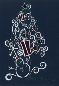 |
 |
 |
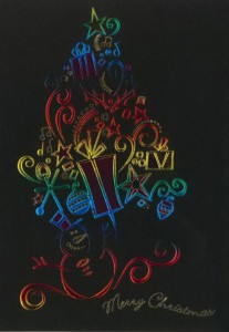 |
The creative team will once again gather to review and discuss the different holiday cards. They will decide what works and what doesn’t work in terms of color, style and finishing. They will also decide if any revisions need to be made to the final design. With so many choices and options, this isn’t always an easy process. But in the end it’s worth it, as the Gallery Collection has some of the most visually stunning cards available.
After much discussion, a final design is chosen. It combines the beauty of Lauren’s winning artwork with the amazing skills of our creative team. Two amazing cards were made from this one beautiful design, and they will truly take your breath away!

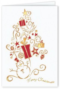
Snowman Surprise
Christmas Card
Every design that graces the cover of our catalogs and is displayed on our website must adhere the high quality standards of the Gallery Collection. Changes are made to most designs, whether it’s sizing, color, or addition of foil. So whether the design has been submitted by one of our talented artists, or the design is a scholarship winning contest entry, they all go through the same process. This ensures that we always have the most beautiful, high quality greeting cards around.
The card is actually simple, not over decorated nor plain in design. But I can’t resist its own beauty!
Aren’t snowmen fun?! I also like 300338-Snowman Holiday Greetings. So cute!
I find this type of art so fascinating. I wish I was as talented as these scholarship winners.