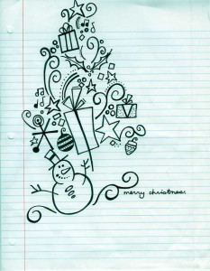
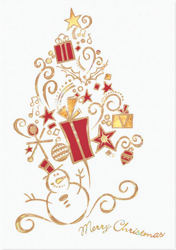
In our current entry into the Look Back Series for the 3rd Annual Create-A-Greeting-Card Scholarship Contest, we are going to take a look into the transformation of Lauren Ondreko’s winning entry into the final card that we have on sale today.
The process begins with Lauren’s entry being scanned into the computer to create a Hi-Res version of it for editing. Below is the original artwork that Lauren Submitted to the scholarship contest.

This is what Lauren’s entry looked like after it was scanned into the system for editing.

The next step after scanning in the artwork is to clean up the image and sharpen the edges so that the production person, or Imager, can get to work. At this point the front sentiment is also added to the card and the card design begins to take shape!

Once the image is cleaned up and the front sentiment is added, the card is ready to go through the separation process. The imager determines the different colors and finishing techniques to be used on this Christmas card design. There are all kinds of options to choose from such as including ink color choices, die cutting, foil-stamping and foil embossing.
The creative team will get together and go over all of these choices to test out and find the best one to use. There are many different colors of paper stock, and some of these colored stocks will be tested with different types of inks or foils, depending on the design. Once the team narrows down the combinations, the card is sent to production so that the creative team can actually see all of the different choices and decide which will be the final one. Take a look below to see what these test designs look like.
After much discussion and back and forth, the final design was chosen and added to our line as the Snowman Surprise Christmas Card.

Once again, we want to thank you for stopping by and taking a behind the scenes look into the transformation of Lauren Ondreko’s entry into the beautiful card it is today. We hope you come back next week for another entry it our Look-Back Series!
What an interesting post! I am very impressed by Lauren’s original artwork and loved seeing how it was transformed into a beautiful and visually stunning card. I’m glad the creative team went with the red and gold… the rainbow design doesn’t exactly scream Christmas to me. But interesting, nonetheless!