We’re pleased to announce that 3 Monthly Finalists were chosen for June! Each monthly finalist will receive a $75 Amazon gift card. Be sure to tell us what you think of the monthly winning designs by leaving a comment below; we’d love to hear from you! **And don’t forget, even if you weren’t chosen as a Monthly Finalist you may still be in the running for the $10,000 scholarship.
If you haven’t submitted a design yet for our $10,000 Create-A-Greeting-Card Scholarship Contest, why wait? You might just be one of the next monthly prize winners.
Make it easy for your friends and family to view the Monthly Finalists by posting the following link to your personal or school website: https://www.gallerycollection.com/greeting-cards-monthly-finalists4.htm
Or, pass on the code below to your school webmaster or someone you know with a website or blog:
Congratulations to…
| Christina Yurksaitis of Portsmouth, Virginia, a sophomore at I. C. Norcom High School |
 |
|
|
|
| Brittany Vesper of Clarence, New York, a senior at Clarence High School |
 |
|
|
|
| Kristall Gutierrez of Nampa, Idaho, a senior at Columbia High School |
 |
|
|
|
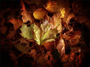
the leaf one is pretty and feels like it has a story behind it (or beneath it as it is a card).
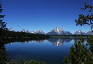
The photo of the mountains is beautiful as a photograph, but i wouldn’t use it as a card.
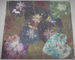
and… i am not sure what to think about the other one. the photo of it is …strange.
the leaf one is pretty and feels like it has a story behind it (or beneath it as it is a card).
The photo of the mountains is beautiful as a photograph, but i wouldn’t use it as a card.
and… i am not sure what to think about the other one. the photo of it is …strange.
I think the photo of the lake and mountains is beautiful as well I can see it being made into a variety of greeting cards – even a Christmas Card once you add some of that foil and sparkle I see on so many of the cards on this site. The 2nd one with the hearts is unusual it’s artsy but not sure of the use of that one unless it was a Valentine card or something. I love the third one and can totally see it being a Thanksgiving card if you add some wording to the front.
Although the mountain picture is pretty, it’s sort of plain. The heart picture is weird because you can tell that the picture was taken of another piece of art. It’s different, but it’s kind of like taking a picture of the Mona Lisa; taking credit for someone elses work. I really like the leaf picture. The photo is well put together. You can tell there was time and effort put into it to create just the right effects. Obviously, the third one is my favorite and I believe it deserves to win.
Wow, the picture of the leaves capture the perfect fall foliage colors .